What Exactly is Screen Resolution? (Pixels Explained)
Think of your computer monitor or phone screen as a massive grid made up of millions of tiny, colored light bulbs. Each one of these little light bulbs is called a pixel.
Your Screen Resolution is simply a way to measure exactly how many of those tiny bulbs are packed into your display. It is always written as two numbers: the number of pixels going across the screen, multiplied by the number of pixels going down.
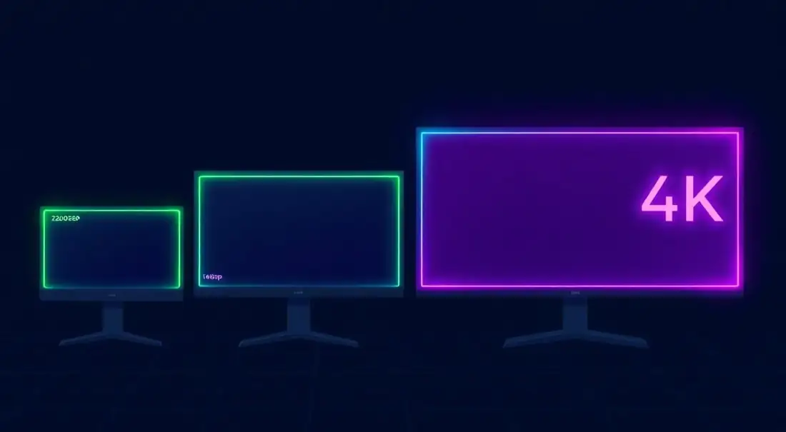
A Quick Example: 1080p vs. 4K
- 1920 x 1080 (Full HD): This means your screen has 1,920 pixels going left to right, and 1,080 pixels going top to bottom. That equals over 2 million total pixels!
- 3840 x 2160 (4K UHD): This screen packs in over 8 million pixels. Because there are so many more pixels squeezed into the same space, the picture looks incredibly sharp and lifelike.
The Golden Rule: The more pixels your screen has, the sharper and clearer your text, photos, and video games will look. If your screen has a low resolution (very few pixels), the image will look stretched, blocky, or blurry.
Why Does Screen Size Matter?
Knowing your display specs matters more often than you'd expect. Web developers need viewport numbers for responsive breakpoints. Gamers need to make sure they're running at native resolution so the image doesn't look blurry from upscaling. Even for basic troubleshooting, sharing this information helps identify issues faster and avoids unnecessary guesswork.
Running below native resolution means your monitor is stretching the image, which softens everything. Running above native (supersampling) looks great but hits your GPU hard. If you want to check whether your display is actually running at the right refresh rate too, head over to the Refresh Rate Test. And if you want to see how your system handles rendering, the FPS Test will show you in real time.
Why Does My Screen Look Blurry or Stretched?
Have you ever plugged in a new monitor or opened an older video game, only to find the picture looks stretched out, squished, or incredibly blurry? This usually happens for one of two simple reasons:
- The Wrong Aspect Ratio: If you try to force a square image onto a wide, rectangular screen, your computer has to stretch the picture to make it fit the borders.
- Not Using the "Native" Resolution: Every monitor has an exact, physical number of pixels built into it (this is called its native resolution). If you own a crisp 4K monitor but your computer is only sending out a 1080p signal, the monitor has to guess how to fill in the missing blanks. This guessing game makes the text and images look soft and blurry.
The Quick Fix: Always make sure your computer's display settings perfectly match the native resolution of your actual monitor.
How to Change Your Screen Resolution
If your test results at the top of this page look wrong, or if your screen just doesn't look as sharp as it should, you can fix it in seconds. Here is how to adjust your display on any device.
How to Fix Resolution on Windows 10 & Windows 11
- Right-click anywhere on the empty space of your desktop background.
- Click on Display settings from the pop-up menu.
- Scroll down until you find the Display resolution drop-down box.
- Click the menu and select the option that says (Recommended) next to it. That is your monitor's perfect, native size!
How to Fix Resolution on Apple macOS
- Click the Apple Logo in the top-left corner of your screen.
- Select System Settings (or System Preferences if you are on an older Mac).
- Click on Displays in the left sidebar.
- Choose your monitor and select the Default resolution to make everything perfectly crisp. You can also pick a "Scaled" option if you want to make the text larger and easier to read.
Can I change the screen resolution on my phone?
Unlike computers, Apple iPhones automatically lock perfectly to their native resolution—you cannot change it. However, if you own a high-end Android phone (like a Samsung Galaxy), you actually can! Go to Settings > Display > Screen resolution. You can lower the resolution to save your battery, or crank it up to maximum (WQHD+) to make your screen look incredibly sharp.
Understanding Display Scaling
Modern operating systems use display scaling to make text and UI elements readable on high-resolution screens. A 4K monitor at 100% scaling would make everything tiny, so most people run at 125-200% scaling. This means your "effective" resolution is lower than your hardware resolution, and that's totally normal.
The Device Pixel Ratio (DPR) shown above tells you this relationship. A DPR of 2 means each CSS pixel is backed by 4 hardware pixels (2×2), which is why text and images look sharper on Retina displays. Web developers need to know this because they should provide 2x or 3x resolution images for high-DPR screens to avoid blurry photos and icons.
Common Resolutions at a Glance
| Name | Resolution | Best For |
|---|---|---|
| HD (720p) | 1280 × 720 | Budget laptops, older monitors |
| Full HD (1080p) | 1920 × 1080 | Gaming (24"), everyday use |
| QHD (1440p) | 2560 × 1440 | Gaming (27"), content creation |
| 4K UHD | 3840 × 2160 | Professional work, 32"+ monitors |
| Ultrawide | 3440 × 1440 | Productivity, immersive gaming |
| Super Ultrawide | 5120 × 1440 | Multi-monitor replacement |
Resolution vs. Screen Size: PPI Matters
Resolution alone doesn't tell you how sharp your display looks. It's resolution combined with physical screen size that matters - measured as PPI (Pixels Per Inch). 1080p on a 15-inch laptop looks crisp because the pixels are packed tight. That same 1080p on a 32-inch monitor looks softer because the pixels are spread thinner.
A quick rule: for a 24-inch monitor, 1080p works well. At 27 inches, go for 1440p. At 32 inches and up, 4K starts making a real difference. Below these, you'll start noticing individual pixels, especially in text.
For Web Developers
CSS media queries target the viewport, not the screen resolution. A 4K monitor with 200% scaling has a viewport of about 1920×1080 CSS pixels even though there are 3840×2160 hardware pixels behind it. This trips people up all the time.
DPR matters for images. On a 2x display, a 200px image needs a 400px source file to look sharp. Use srcset and responsive images so you're not serving blurry photos to Retina users or wasting bandwidth on 1x screens.